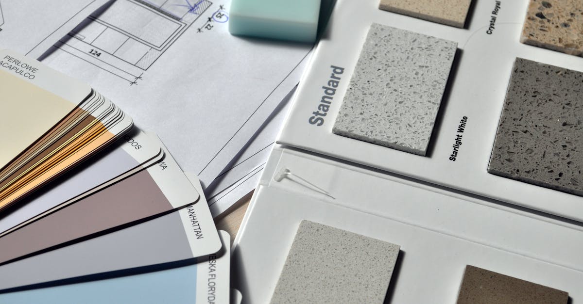
This article provides essential tips for color coordination in crafting, emphasizing the importance of understanding color theory. Readers will learn about the color wheel, key concepts like hue, saturation, and value, and various color harmony schemes such as monochromatic and complementary palettes. Practical guidelines will help in the color selection process, including the 60-30-10 rule for color distribution. Finally, common challenges in color coordination will be addressed, providing solutions to create visually appealing and harmonious combinations.
Current Trends in House Painting and Remodeling
Transforming a living space through painting and remodeling can breathe new life into a home, making it not only more beautiful but also more functional. As trends evolve, homeowners are increasingly looking for innovative ways to update their interiors, blending aesthetics with practicality. Whether it’s choosing a bold color palette that reflects personal style or integrating sustainable materials for a contemporary look, the right choices can make a significant impact.
Current trends highlight a return to earthy tones and the incorporation of natural elements that evoke a sense of comfort and serenity. Neutral shades are making a comeback, but with a twist, featuring comforting undertones that create inviting atmospheres. Additionally, techniques such as ombre and faux finishes are gaining popularity for those looking to add depth and character to their walls. Homeowners are also embracing open concept designs, which call for creative coloration to delineate spaces while maintaining a cohesive flow. In this article, we will dive into the latest trends, offering insights into popular colors, innovative materials, and practical tips for modern home enhancements.

| Feature | Details |
|---|---|
| Color Wheel Understanding | Utilize the color wheel to visually organize and mix colors effectively. |
| Color Harmony Forms | Apply monochromatic, complimentary, and triadic schemes for balance. |
| 60-30-10 Rule | Distribute colors in a dominant, secondary, and accent ratio. |
| Contextual Considerations | Factor the environment and lighting when selecting colors. |
| Testing Palette | Create samples to preview the color combination before applying. |
| Documenting Colors | Record color codes for consistency in future projects. |
| Texture and Value Variation | Incorporate different textures and values to enhance visual interest. |
| Emotional Impact | Consider color psychology to elicit desired emotional responses. |
| Neutral Base with Accents | Use a neutral base with pops of color for a balanced design. |
Current Trends in House Painting and Remodeling
When it comes to enhancing living spaces, the current trends in house painting and remodeling are not just about aesthetics; they reflect a deeper understanding of color psychology, sustainability, and innovative materials. As more homeowners look to refresh their environments, it’s crucial to stay informed about effective strategies that can be employed to create a harmonious home.
Understanding Color Psychology in Home Improvement
Color psychology plays a significant role in the way spaces are perceived and experienced. Different colors evoke various emotional responses and can influence the overall mood of a home. For instance:
- Blue: Often associated with tranquility and calmness, making it perfect for bedrooms and bathrooms.
- Yellow: A color of cheer and warmth, ideal for kitchens and family areas where social interaction occurs.
- Gray: A versatile neutral that provides a sophisticated backdrop for any room, allowing decor accents to pop.
Incorporating these colors strategically can enhance both style and comfort. For instance, painting an accent wall in a lively color like teal can add a modern touch while maintaining a relaxed atmosphere in living rooms.
Popular Color Palettes for 2024
As design influences shift, so do the preferred color palettes. The following palettes are gaining popularity:
- Earthy Tones: Think muted greens, rusty reds, and soft browns. These colors create a warm, inviting atmosphere and are often used with natural materials like wood and stone.
- Pastels: Soft colors such as mint, pale pink, and lavender offer a fresh, delicate aesthetic, particularly resonating in nurseries or bathrooms.
- Bold Jewel Tones: Rich colors like emerald green, sapphire blue, and amethyst purple bring a dramatic flair and work well in formal spaces.
For anyone considering a remodel, blending these colors into features can amplify the design. For example, a deep blue kitchen island against soft cream cabinets can create an elegant focal point.
Innovative Painting Techniques
In addition to color choices, painting techniques are evolving. Here are some contemporary approaches to consider:
- Ombre Effect: This technique involves a gradual blending of one color to another, creating depth and interest on walls.
- Stripes and Patterns: Adding stripes or geometric patterns can infuse energy and modernity. It’s an excellent way to engage visually without overwhelming a space.
- Color Washing: A soft, transparent layer of color is applied to add depth and texture, suitable for rustic or vintage-style decor.
Experimenting with these techniques can add a personal touch to spaces, making them feel unique and tailored to individual tastes. Painting the ceiling a shade lighter than the walls, for instance, can dramatically alter the perception of space, making it feel larger.
Sustainable Materials in Remodeling
Environmental consciousness is more relevant than ever. Many homeowners are opting for low-VOC (volatile organic compounds) paints that are healthier for both occupants and the environment. The rise of recycled materials in remodeling is noteworthy:
- Reclaimed Wood: Used for flooring, cabinetry, and accent walls, reclaimed wood contributes to a homey feel while promoting sustainability.
- Recycled Glass Tiles: Ideal for kitchens and bathrooms, these tiles come in a myriad of colors and patterns, offering durability and a unique aesthetic.
- Eco-Friendly Paints: Brands are increasingly providing paints with minimal environmental impact, offering durability alongside safety.
Incorporating these materials can not only enhance the visual appeal of a home but also contribute to environmental conservation.
Transforming Spaces with Cohesive Design
The transition from one room to another can affect the overall flow of a home. A cohesive design throughout the house can be achieved by considering the following:
Consistent Color Schemes
Utilizing a consistent color scheme throughout different spaces can unify a home, creating a sense of harmony. A good approach is to use the 60-30-10 rule:
- 60%: Dominant color for larger areas (walls, larger furniture).
- 30%: Secondary color used for upholstery, curtains, and other larger accents.
- 10%: Accent color for smaller decor items like cushions, artwork, and accessories.
This method ensures that different rooms complement each other without overwhelming variation. For example, a serene green used in living areas can be carried through to bathroom accents and kitchen tile designs.
Integrating Architectural Features
Aesthetic upgrades can also capitalize on existing architectural features. Highlighting door frames, moldings, and windows with contrasting colors can add depth and character. Enhancing these features with color can create a timeless look while drawing attention to the home’s unique style. Explore best practices through resources like this guide for more insights on how to beautifully utilize these elements.
Texture and Material Consideration
Texture adds another layer of visual interest. Incorporating varied materials can create contrast and enhance the overall effect of the paint color. Consider mixing:
- Flat and Glossy Finishes: Use flat finishes for walls and glossy finishes for accents like moldings and trims to create a sophisticated look.
- Natural Elements: Pairing painted surfaces with natural textures like woven fibers, stone, or metal can balance modern and organic aesthetics.
By taking time to layer textures and materials, a designer can make a space feel layered and intentional. For example, a matte finish paint can stand out beautifully against a glossy backsplash in a kitchen.
Maximizing Quality and Value
Investing in quality materials and skilled labor can significantly increase a property’s value. Homeowners planning a renovation should consider the long-term benefits of using premium paints and high-quality finishes. Often, these come with warranties that ensure durability and lower maintenance costs over time.
For those looking to enhance their home with creativity, function, and sustainability, understanding these trends is essential. It’s about crafting spaces that not only appeal visually but also resonate with personal style and environmental consciousness.
By being informed and intentional about choices in painting and remodeling, homeowners can create beautiful, functional spaces that reflect their identity and enhance their quality of life. For guidance or professional assistance, services such as color and texture coordination can provide value in selecting the perfect palette for any project.

Transform Your Space Today
Elevate your home with our expert painting and remodeling services! Experience stunning results, personalized consultations, and a seamless process that leaves your space looking amazing. Let’s bring your vision to life—get in touch now!
Current Trends and Practical Tips in House Painting and Remodeling
Trends in House Painting
- Bold Color Choices
Vibrant hues like deep teal, rich emerald green, and warm terracotta are making a significant comeback, allowing homeowners to express their personality.
- Matte Finishes
Matte paint finishes provide a sophisticated and modern aesthetic, reducing glare while adding depth and richness to walls.
- Accent Walls
Designing a single wall in a bold color or unique pattern can create a focal point and makes a room look modern without overwhelming the space.
- Eco-Friendly Materials
With an increasing focus on sustainability, more homeowners are opting for non-toxic and low-VOC (Volatile Organic Compounds) paint options that are better for the environment and indoor air quality.
Practical Tips for Painting and Remodeling
- Plan Your Color Palette
Use online resources or color wheel tools to create a harmonious color palette that reflects your personal style and compliments existing furnishings. Consider the 60-30-10 rule for balancing dominant, secondary, and accent colors.
- Test Samples on Walls
Before committing to a color, apply a small sample patch of paint on your walls and observe it at different times of the day to see how lighting affects the hue.
- Invest in Quality Materials
Using high-quality brushes, rollers, and paints can make a significant difference in the finish and durability of your painting project.
- Prepare Surfaces Correctly
Properly prep walls by cleaning, sanding, and priming them to ensure the paint adheres well and the final result looks smooth.
- Consider Professional Help
If you’re unsure about tackling a remodeling project alone, hiring professionals can save time and ensure a high-quality finish that meets your expectations.
Innovative Remodeling Techniques
- Open Concept Layouts
Removing non-structural walls can create more open spaces that are ideal for modern living, making homes feel larger and more inviting.
- Smart Home Integration
Integrating smart technology into remodels, such as smart lighting and automated systems, enhances the functionality and energy efficiency of homes.
Frequently asked questions
Glossary of Key Terms Related to Home Painting and Remodeling
- Color Theory
- The study of how colors work together and how they affect emotions and perceptions in design.
- Monochromatic
- A color scheme that uses variations in lightness and saturation of a single hue to create harmony.
- Complementary Colors
- Colors that are opposite each other on the color wheel, creating strong visual contrast when paired.
- Analogous Colors
- Colors that are next to each other on the color wheel, providing a rich, harmonious palette.
- Saturation
- The intensity or purity of a color; high saturation colors are bold and vibrant, while low saturation creates muted tones.
- Value
- The lightness or darkness of a color; lighter versions are called tints, and darker versions are known as shades.
- Accent Color
- A color used to create emphasis or focus against a predominant color, adding visual interest to a design.
- 60-30-10 Rule
- A guideline for color distribution in a room’s design, suggesting 60% dominant color, 30% secondary color, and 10% accent color.
- Texture
- The surface quality of a material that can affect the look and feel of painted or remodeled spaces.
- Color Palette
- A selected range of colors used in a project, helping to maintain coherence and style throughout the design.
Understanding the principles of color coordination is essential for enhancing any craft project or home improvement endeavor. By learning to navigate the color wheel, recognizing the emotional impacts of different hues, and applying color harmony rules, it becomes easier to create visually appealing and meaningful designs. Whether it’s a wall renovation, DIY crafting, or simply revamping personal space, utilizing the strategies from Crafting a Palette will empower creativity and ensure successful outcomes. It is time to embrace these techniques and transform spaces through the art of color.
Understanding Color Basics
Before diving into sophisticated color combinations, grasp the fundamental concepts of color theory. Recognizing primary, secondary, and tertiary colors will help in making informed decisions for any project.
- Familiarize with the color wheel: Use it to visualize relationships between colors.
- Learn about hues: Grasp the differences in saturation and value, which impact the mood of your creation.
Choosing Your Base Color
Selecting a base color sets the tone for your palette. Consider the emotion or vibe you wish to evoke. Utilize the following approaches:
- Assess existing elements: Ensure that your base color complements existing furniture or decor.
- Think about the purpose: For relaxation spaces, calming hues like blues and greens are preferable; while vibrant shades like yellows energize.
Creating Balanced Color Combinations
Effective color coordination requires understanding different color harmony schemes. Here are some ideas:
- Analogous schemes: Choose colors that sit side-by-side on the color wheel for a serene and cohesive look.
- Complementary colors: Pair colors that are opposite on the wheel for a dynamic contrast, ideal for making elements pop.
- Utilize the 60-30-10 rule: Allocate 60% for the dominant color, 30% for a secondary color, and 10% for accents.
Experimenting and Testing
Practice is key in color coordination. Consider these steps:
- Create mockups: Before finalizing your color choices, make small samples or samples to visualize how they work together.
- Evaluate under various lighting: Observe colors in different lights to ensure they align with your vision.
Transform Your Home with Expert Painting and Remodeling
Enhance the beauty and functionality of your space with our top-notch painting and remodeling services. Our skilled professionals will work closely with you to create a unique environment that reflects your style while boosting your home’s value. Get ready to enjoy a fresh and inspiring atmosphere today!
Sophia Torres is the creative mind behind the most dazzling transformations at TS Painting & Restoration. With a strong background in interior design and a deep passion for tropical color palettes, she has helped hundreds of clients revitalize their spaces into vibrant and inviting environments. Born in Colombia and raised in Florida, Sophia brings a unique perspective to her work, blending Latin American influences with modern design trends.
Sophia’s vision of color goes beyond the conventional. She is known for her ability to create bold and unexpected combinations that reflect Florida’s natural beauty. Her focus on color psychology and strategic use of tones allows her to transform any environment, making each project a showcase of her clients’ personal style. On her blog, she shares practical tips on how to choose colors that not only beautify but also enhance emotional well-being and create harmony in the home.
When not working, Sophia enjoys exploring art galleries, experimenting with DIY projects, and finding inspiration in Florida’s lush landscapes. For her, design isn’t just about aesthetics; it’s about creating spaces that tell a story, reflect the identity of those who live there, and evoke positive emotions. At TS Painting & Restoration, Sophia is committed to helping homeowners discover how colors can transform their homes into true havens of tranquility and beauty.